Mythic - iOS App design
For the comics startup 3W3M, I designed their first iOS app, Mythic — a marketplace for comics, first for their existing Substack community.
I led the product from 0–1, creating brand components, color palettes, typography, UI elements, and interactions. The app launched first to a beta group of Substack users before releasing publicly on the App Store in 2024.
Project Details
Goals & Process
At Mythic, I worked with comic writers and illustrators with experience from Marvel who were spinning up their first app to showcase their multi-universe comics 3W3M, as well as create a marketplace for comics where their built-in user base of comic fans could read, purchase, and save their favorite titles. Along with the app’s design, for this project, I defined the app’s visual look and feel and led product strategy alongside the company’s CEO and CTO.
To begin, I did market research and hosted a brand workshop with our start-up team to define the building blocks of the Mythic / 3W3M visual brand, including brand definition, picking color palettes, and typography which allowed me to have the base elements to begin design. Concurrently, I met with the CTO, CEO, and team to define the app’s goals and created a design schedule to align with engineering. I next created app user flows and product requirement docs for each of our main app product areas to frame scope, app content, and app structure informed by market research I completed in this role, as well as input from the team.


Process
In order to begin designing the UX for the app and overall IA structure, I created app user flows and met with our start-up team to ensure I was covering all of the content needs for the app. The app’s structure then relied on market research and comparable experiences to define it. I also researched content app metrics at this time to help our team plan which metrics would be tracked in our app to test success upon release in the App and Play stores.
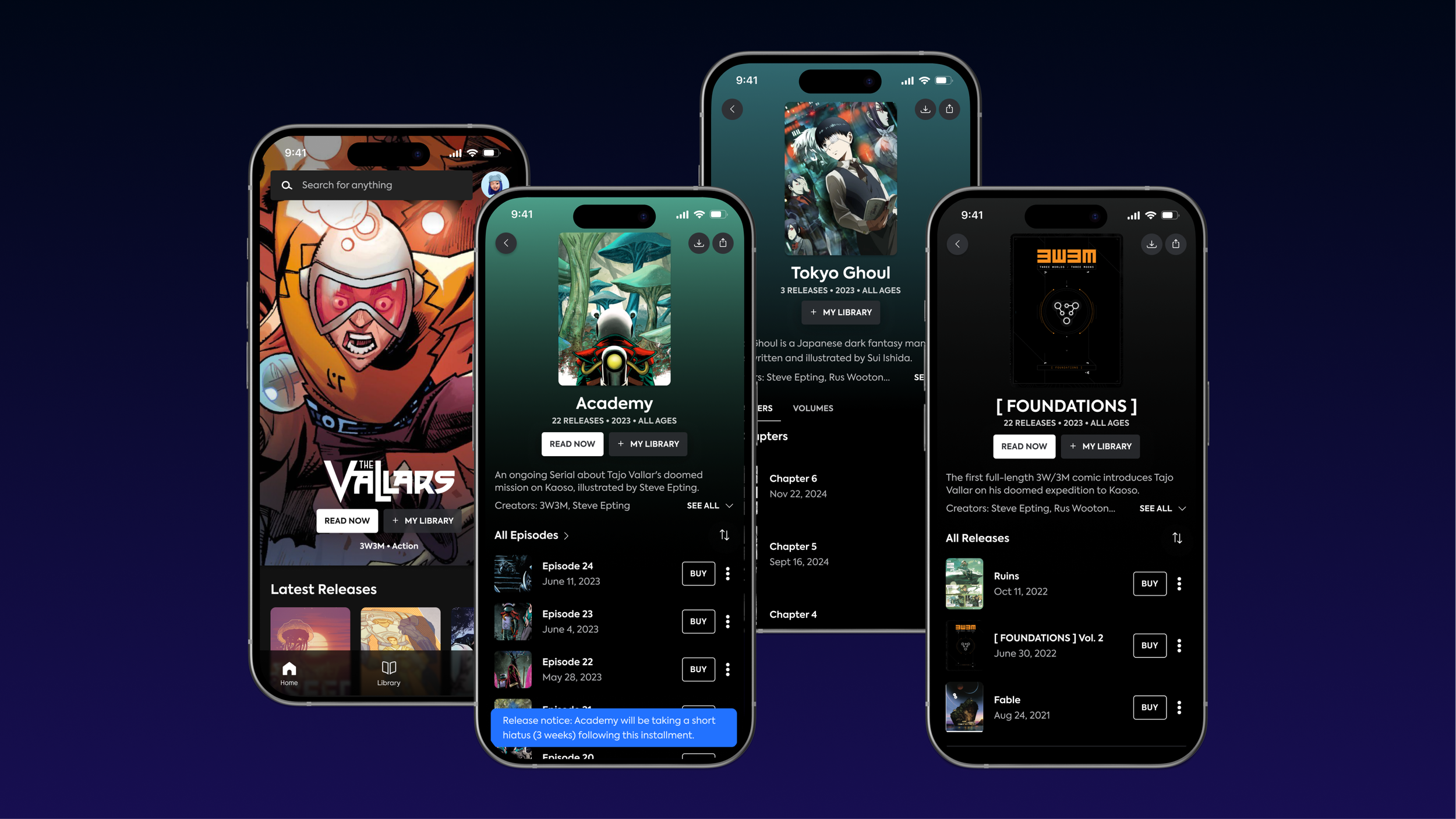
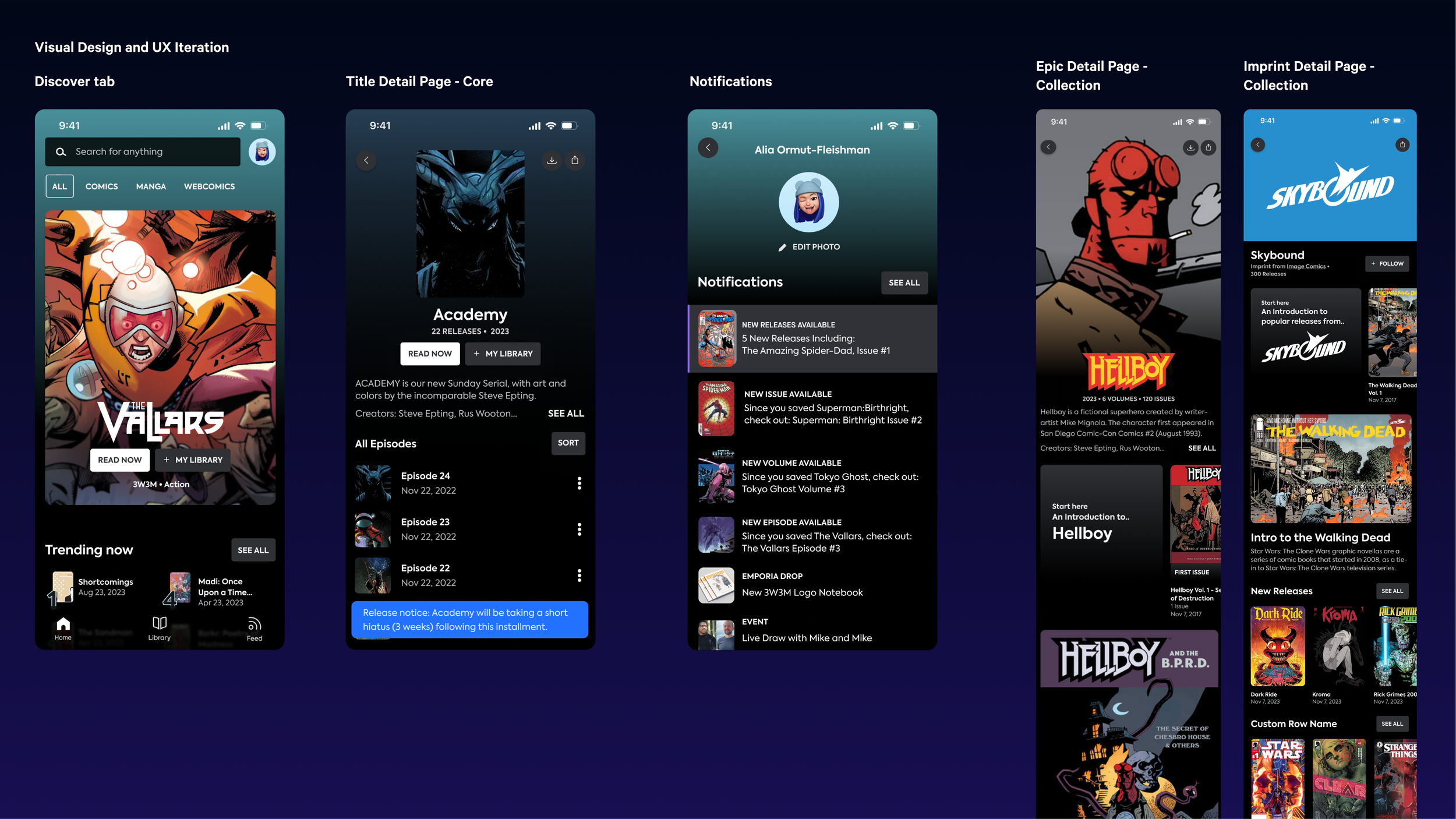
As a result of the above design discovery phase, after collaboration with Mythic’s co-founders and CTO, I created a user flow mapping out the app’s main pages. The app’s structure focused on 3 main pages: a Discover tab to help users discover new 3w3m releases and comic content, a Feed tab to interact with comic artists and a Library tab for users to save comic releases and create their ‘comic collection’.
Once the app structure was defined, I created a feature design schedule to map with engineering’s timeline. I first designed the app’s Discover feed, knowing that I would need to incorporate content page designs that would include complexity in designing for different releases and different types of comic publishers.
After spending time designing Discover tab and content pages, I designed the app’s library tab, feed, and notification experiences.
As I worked through designing each feature, I began with low-fidelity user flows and wireframes, and framed design decisions with market research before working into higher fidelity visual mock designs and prototypes to share with the team. I then reviewed each feature iteration with our CEO, CTO, and engineers before finalizing our feature designs as we worked towards an initial beta release to test with users.

Iteration
IA Structures and UX Complexity
As I designed the content pages that lived off of our Discover tab, I scoped with Mythic’s CEO that there was a design need to design different content pages for multiple types of pieces of content. Content pages for the app were defined for differing types of comic titles including: Title Releases for US and European comics, Manga releases as well as Issue releases and singular titles. This was significant as it led to designing differing UX flows to read content from different release types.
Additionally, I defined with our CEO that to reach parity with other comparables, we should include different content collection pages for Publishers and more general comic collections to reach parity with other popular comic marketplace apps like Webtoon and GlobalComix.
Due to the complexities of the different comic release types needs in terms of content structure, I spent time at this stage creating IA flows to create content structure. After defining different release types IA structures, I aligned with leadership and engineering teams to ensure alignment across content and technical needs.
Once we were aligned on the final IA structures, I returned to designing our UX and visual designs for our app.
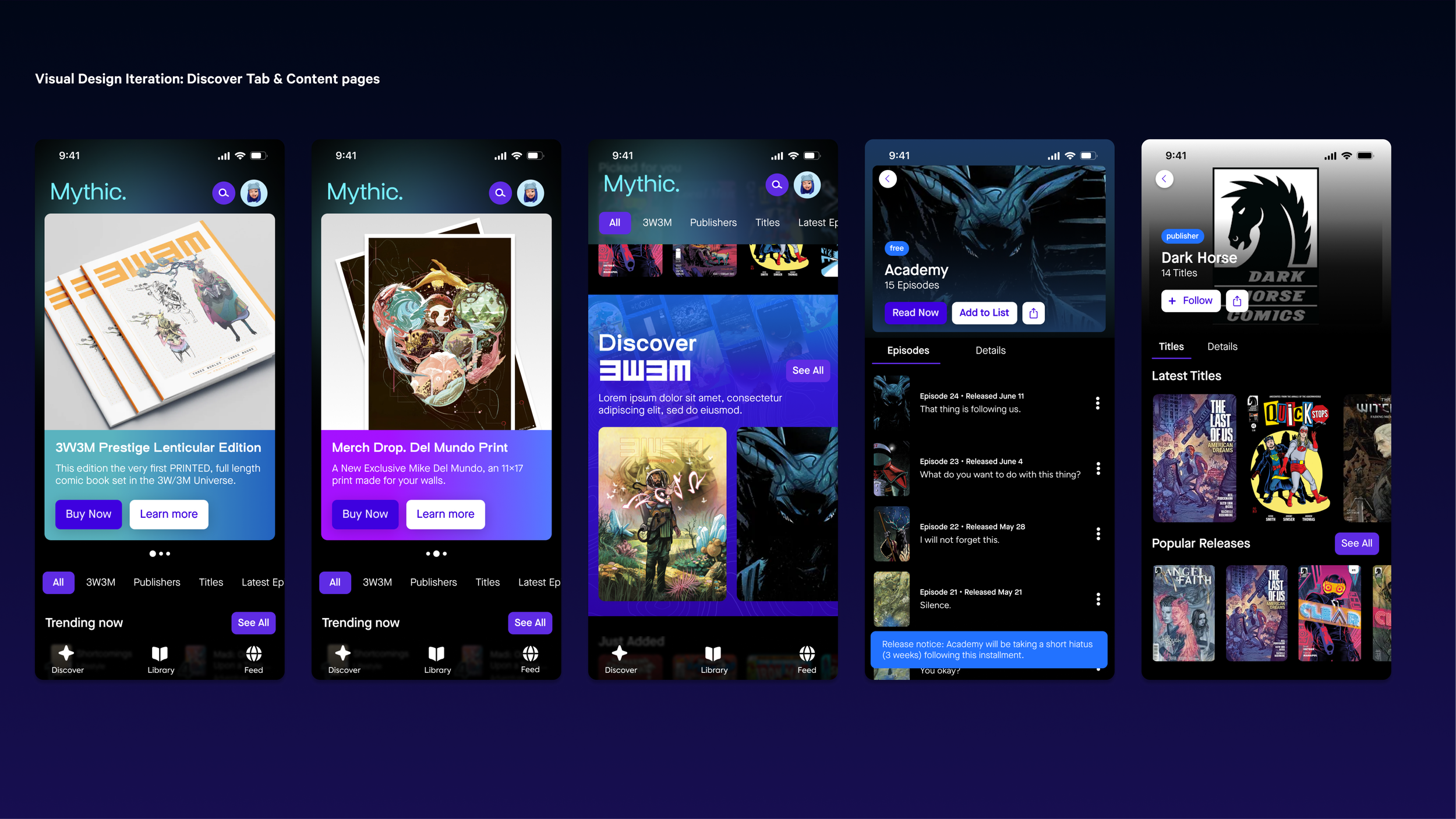
Visual Design Iteration
As I designed the main UX and components for Mythic’s app: the Discover feed, content feed and Library, I iterated on visual design concurrently. To complete the visual design for the app, I relied on the color palette and typography pairing I designed after hosting a brand workshop with our start-up team to get the team’s buy-in for our direction and understand what the brand was trying to achieve, ultimately landing in a direction of framing the app design as current but future facing and scalable. The workshop resulted in Mythic defining their brand as future facing and informed by popular consumer tech apps, the dark and cool color palettes of the company’s comics 3W3M and vaporwave, among other elements.
In the design process, I used a color palette and typography styles aligned on with the team to determine visual styles and explored button color palettes according to semantic meaning. To align on visual direction with the team, as a result of our brand workshop, I created a brand mood board of apps, websites, and illustrations with a sci-fi feel, incorporating the illustration style of the start-up’s flagship 3W3M comics, as well as several typography pairings that would fit the brand’s definition from our workshop that the team could choose from.
As I designed the discover tab and our main tabs, as mentioned, I iterated on visual design and reviewed against the light brand guidelines I created for the team to evaluate designs.


Final Designs
Design Delivery & Outcome
After iterating on visual designs with the team, and receiving initial feedback from investors, designs were completed for Mythic’s first iOS app. The app’s features include: a discover feed to discover and save new content, a feed for Mythic and it’s artists to get in touch with their community, a comic reader with multiple reading modes and a content library to create a user’s comic book collection. Throughout the app’s design, our goal was to create an intuitive way for customers to discover and consume comics digitally, without losing the magic of consuming the medium. This app’s design was a great exercise for me to think through end to end UX and visual design throughout an app and executing quickly - we finished the app’s concept, direction and full design in eight months, and have since received positive reviews from users.
The app design was released first to Substack members, and subsequently had a release in the app store for iOS.