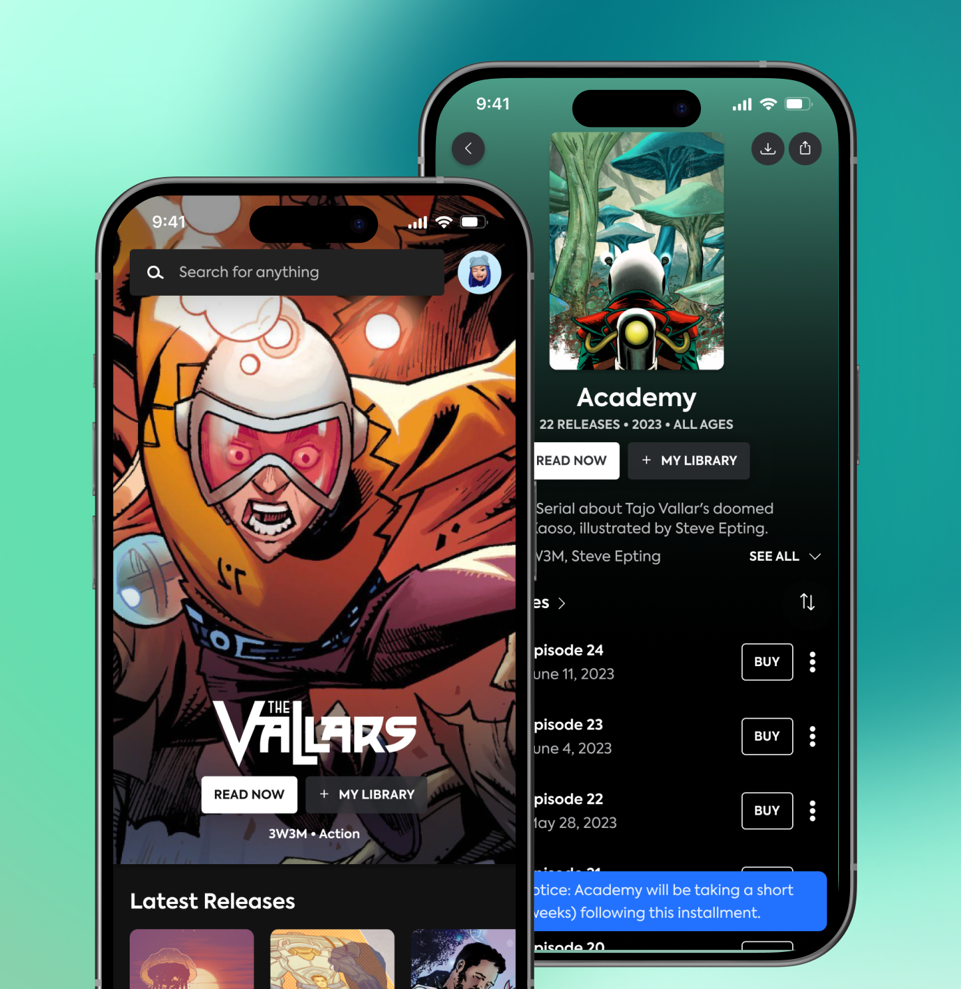
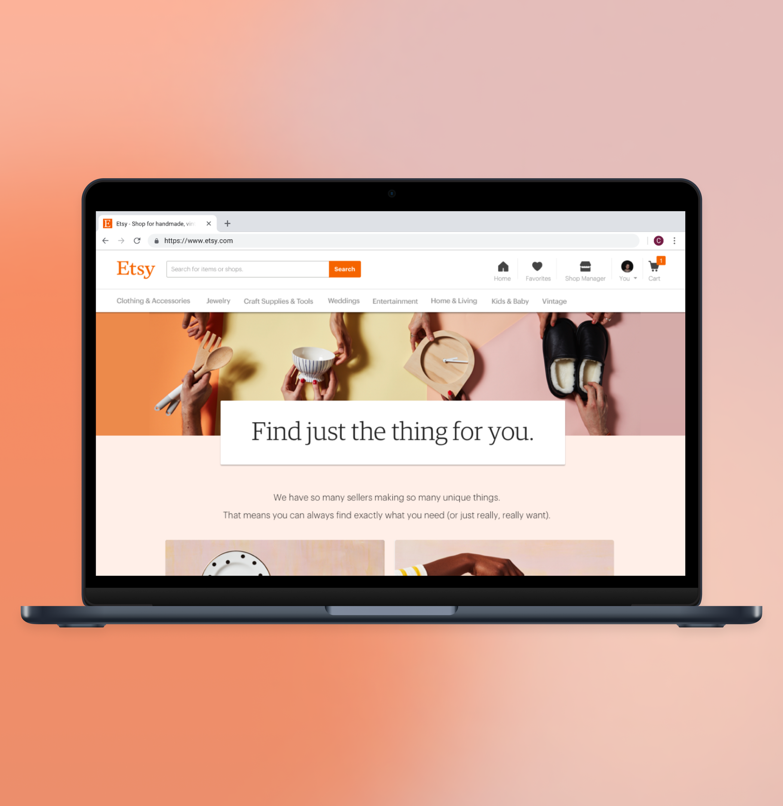
Role:
Lead Designer, UX, Visual Design
Project description:
While at MasterClass on the Consumer Product Design team, I led the global redesign of our Search experience across Web, iOS, and Android platforms. This project was prioritized following the successful redesign of our Library page, which was aimed at enhancing content discovery for users. Initially, Search was not redesigned due to scope limitations for our Library project, but in Q3 2022, we decided to invest in its redesign due to the significant number of users relying on Search to find content. Many users were abandoning searches or not getting the desired results.
The previous Search experience was challenging to access as it was only available on the Library page, and the search results were disorganized in long dropdown UIs. As the lead designer, I collaborated with cross-functional teams including engineering, product, and data, as well as with the Design Systems lead to develop new pattern designs. This project was designed to scale for both Consumer and Enterprise (B2B) use cases, similar to our Library project.
Project Goals / Hypotheses:
Our goals for this project were to enhance Search quality and engagement. Our hypotheses were that placing Search in the Global nav and designing it to improve result understanding would boost content discovery, search usage, and engagement.
Project Scope:
During the design process of this project, after re-alignment with Product and Engineering, we split this project into 2 design delivery phases:
V1 - Search designs to place search in our Global nav, to validate that this would increase Search Usage
V2 - Delivery of Search in Global Nav + Redesigned Search Results page / functionality to prioritize understanding of content types in results
Process:
Initially for this project, I created a design brief including relevant data and project milestones within a Design Timeline that I shared with my Product Manager as she finished her PRD to gain alignment. Throughout this project I met with my cross functional team including engineering, our design team, product and leadership. I also worked with UX researchers to create test plans and prototypes for user-testing throughout this project.
Initial Ideation and Iteration:
I began with low-fidelity mocks and wireframes to define project scope and align with my Product Manager's product requirements. Together, we aligned on globalizing Search, adding personalization, and refining result display hierarchy. As we refined wireframes, leadership suggested improving result visibility, leading to a versioned feature release into V1 (global search) and V2 (redesigned results UI). After we decided to version the Search project releases, I finalized V1 designs for the web, iOS, and Android while also exploring V2 designs. V1 was released in Q1 2023 and boosted engagement across platforms.
Search V2 Context and Design Strategy:
For our Search V2 designs, we aimed to enhance content display by emphasizing parent-child relationships and improving content type recognition. I explored various structural improvements for web and mobile, focusing initially on web due to its larger visual space and higher engagement rate at the time.
Search V2 - Final Designs:
For our final designs, after leadership feedback, I provided structural UI options for Search Results pages, and refined use case flows with the team. We settled on a UX model with a consolidated 'All' view for web, featuring content type tabs for differentiation and unique cell types for each content type. A standout design detail was showcasing 'best match' results prominently in a large, celebratory tile at the top of the UI for web for exact matches, enhancing user experience.
For mobile, we used a tabbed experience to make it easy for users to differentiate content types. We also used larger cell types for Class/Parent level content types, while smaller cell types were used for shorter pieces of content like lessons. I also consulted Material and iOS guidelines when considering the flow and tile design for mobile designs.
For final designs, I created web, iOS, and Android use case flows and prototypes at visual design fidelity. I also created a design spec, including responsive designs, empty states, and edge case mocks.
Search V1 was launched to 100% of users and positively impacted engagement metrics, while Search V2 was released to A/B test and was scheduled for release in Spring 2023. This project resulted in new patterns for web and mobile and an updated global navigation component.
Designs included:
Desktop web, responsive web, iOS, Android
Role:
Lead Designer, UX, Visual Design
Project description:
While at MasterClass on the Consumer Product Design team, I redesigned the Library page for both Consumer and Enterprise product verticals. The project was driven by the need to improve user engagement and facilitate content discovery, especially for Enterprise users interested in browsing by specific skills as opposed to the Categories first browsing we were using on our existing Library.
Methodology / Project Details:
For this project, I initially did market research and jumped into early wireframes while our project scope was being set. I first discussed these wireframes with my direct Product Manager and Design Manager to discuss differing levels of scope and complexity. After this point, I kicked off this project by having a white-boarding session with a product designer who was working on our Enterprise product to get her perspective. While aligning with our larger team (including a secondary Product Manager on our Enterprise team) on project goals and timeline, I put together a design brief including a design schedule the team could use to reference major checkpoint meetings and design hand off dates. Additionally, since this work included development of a new tile pattern that was intended to be used globally on our web, iOS and Android platforms, I worked closely with a Design Systems designer, and managed his workflow for this project.
After initial timeline and scope expectations were set with the team, I worked with our Enterprise designer as we created different wireframes informed by our sketching session. These wireframes were brought to the team to discuss initial levels of complexity we could frame the project within. At this stage, I took the lead on creating wireframes for both our Enterprise and Consumer verticals, considering both platform's needs, informed by our Enterprise Designer and team. A main challenge of this project was creating scalable designs cross-platform that would include the needs of both Consumer and Enterprise verticals.
Scaling Cross Platform Designs
For this project, I conducted market research and created early wireframes while refining the project’s scope. I collaborated with various team members, including Product Managers and Designers, to align on goals and timelines. I also managed the workflow with the Design Systems designer for developing a new tile pattern across platforms. One of the main challenges of this project was creating scalable designs that met the needs of both Consumer and Enterprise verticals.
UX Research
We conducted unmoderated user testing during the final wireframe stage to validate our assumptions and improve user engagement with content. Based on the results, I made design updates such as fine-tuning copy usage and refining selected states for mobile.
Design Delivery
After concluding user testing, we held final checkpoint meetings with our enterprise engineering team and leadership for directional sign-off. I then executed final visual designs for Web, iOS, and Android platforms for both Enterprise and Consumer verticals, incorporating our Design Systems' designer's tile pattern. I created specs and collaborated with the engineering team on design questions and QA during the project build.
Our Library redesign was launched first as an A/B test for Consumer users, and to 100% of Enterprise users initially, and then was released to 100% of all post-paywall users. Client feedback from large Enterprise organizations were positive as we were addressing their needs of browsing content by time and by Skills for Enterprise users.
Since our timeline was condensed for this project, I also followed up by exploring some visual design improvements we could make for this project to improve visual impact.
Role:
UX, Visual Design
Project description:
Recipe Cards was designed as a part of experimenting with features at MasterClass that would create new, interactive learning experiences outside of video content. We invested in this feature design after completing research that validated users were interested in learning with MasterClass in ways that accompanied video content. Specifically, we learned from research that users were interested in and had a need for materials checklists (like ingredients checklists) for Food and Gardening classes.
Hypotheses and Project Goals:
We wanted to drive awareness of recipe cards users could follow along with during video lessons to:
Test engagement with non-video features (which we we also exploring in parallel features)
Create product habituation with the user need of following along with a recipe
Reducing user friction around the video watch and recipe follow along experience.
Project Process:
I started this project by gathering market research and creating various user flows to frame the project's complexity. Collaborating with my team, including Product and Engineering Managers, we defined the scope to cover the end-to-end user journey for Recipe Cards in food classes on the web and iOS. I iterated through low-fidelity mock flows to determine UX and visual design directions, considering entry points, hierarchy, component design, and retrieval flow. I also worked with cross-functional teams, including product, engineering, Brand, and Publishing, to ensure alignment and incorporate feedback. For visual design, I collaborated with our Design Systems lead to create suitable components and gathered feedback from the design team.
Final Designs:
For our final designs, I prioritized video content in our visual hierarchy which became significant when discussing hierarchy with the design and brand teams, highlighted MasterClass’s high-quality food photography, enabled recipe card engagement during video consumption, and provided users with the option to save recipes for later on both web and iOS platforms. These decisions were influenced by user research and guidance from our design team.
For this feature’s final designs, I created end-to-end design flows and mocks at visual design fidelity for web and iOS, as well as prototypes and specs.
Role:
UX, visual design, animation
Project description:
While working on a design team focused on a new app at WeWork called On Demand, that is focused on being able to book WeWork spaces On Demand, I was tasked with designing a new user onboarding and sign up flow. This project also included edge cases around switching a user to sign in flows if we recognized their email address from a pre-existing membership, and sign in flows generally.
Methodology:
For this project, I initially did market research, then created wireframe flows to explore different methods of onboarding and account sign up. After sharing these different options to the team, it became clear that we needed to align on the steps of our flows a little more closely, so I went ahead and did a few user flow options of how a user would get through sign up, and if we would place subscription and payment in our onboarding experience, or if this would be delayed until after a user attempts to book their first WeWork space or room.
From this point, I aligned with the team that we should: remove subscription until a later release due to complexity and lack of user data around subscription needs, and that we should place payment at the time of room booking.
After we were aligned on these elements, I went ahead and explored visual design options, the final option of which is included here. I also created an animation transition for our onboarding moment and prepared full visual design flows and edge cases for the team.
Metrics considered:
Amount of user sign ups, amount of booking conversions.
Credit:
In my final visual designs, the payment flow used was originally designed by Cody Butcher, a designer on my team for his room booking work.
Role:
UX, Visual Design, Research
Task:
For this project, I was tasked with creating a feature to collect user generated photos for reviews, since at Grubhub, we had documented research that showed users were cross referencing menu items without photos on Grubhub/Seamless on external platforms like Yelp and Instagram.
Methodology:
I initially reviewed the past research conducted by our research team, collaborated with my Product Manager to understand the scope of thiss project, and then proceeded with sketching different flow ideas and UIs. At this point, I created a few wireframe iterations, and collaborated with my design team, product managers, and engineers on the project to pick an option.
I then conducted an in person usability test to get feedback around an initial wireframe prototype.
After synthesizing the results of our user testing, I modified the UX of my designs and completed visual designs and animations for this project using Principle. I then worked with engineers to provide VQA feedback and fine tune animations.
Metrics considered:
The main success metric for this project was to create a brand new feature that wouldn’t negatively impact our conversion metric. Secondarily, this initial design was created to see how many photos we could potentially collect from users.
Role:
UX, Visual Design, Research, Collaboration on feature strategy with product
Project deliverables:
Prototype deliverables for user testing, iterative and final product design flow (UX/visual design) of menu combos feature across mentioned platforms
Project description:
We designed menu combos in response to Grubhub onboarding multiple chain restaurants to our platform to solve for creating menu UI that enabled users to order combinations of menu items. Grubhub at the time, only afforded for single item ordering in it’s menu UI, and ordering multiple items bundled as ‘combos’ was something we observed as a dominant behavior of users ordering at chain restaurants in research conducted by Grubhub’s research team.
Task and process:
I was tasked with designing a feature to allow users to order combination meals from chain restaurants easily via Grubhub/Seamlesss menus. This feature was designed cross platform for Grubhub’s mobile and desktop apps (desktop web, mobile web, iPhone and Android) that was designed to be applied to multiple restaurant’s chain menus.
In terms of my involvement in this project, I paired with our product team to establish scope, and I designed this feature end to end, including sketching and wireframe stages, to qualitative user testing to final visual design. The visual design of this project also included new component and animation design.
Shown here examples of the project at it’s different stages, from wireframe fidelity to visual design.
Metrics considered:
Stability in conversion metrics compared to overall product metrics.
Role:
UX, Visual Design
Project Description:
Just the thing was a global marketing campaign that Etsy was launching for Spring 2017. The impetus for this campaign was showing users that Etsy has a multitude of items, or 'just the thing'.
Project Scope:
For this project, I was tasked with designing the UX of the front of the funnel of the experience for how users would arrive at this page from traffic drivers, as well as the landing page design itself.
Methodology:
I began this project collaborating with a brand designer at Etsy on the landing page’s ideal look and feel. Once we had a concept, I created UX flows, wireframes and visual designs for this project, meeting with brand, marketing teams and our product design systems team to get approvals and input from each team along the way.
For this project, as mentioned, I worked with Etsy’s brand team to integrate photography and GIF creative they shot for this campaign. Additionally, I worked with Etsy’s marketing team to create a landing page template they could populate with curated items throughout the design process of this project. As mentioned, I also worked with Etsy’s product design systems team for this project for customized components I used for this project’s landing page design.
Pictured here are final wireframes for the landing page of this project, as well as the final visual design for the landing page. This project also included homepage placements in association with this campaign.
Credits:
Photography/Art direction/copy: Etsy Brand team
Marketing concept: Etsy Marketing team
Role:
UX, Visual Design
Project description / scope:
For this project, I was tasked with concept work of imagining the future of Etsy's Editors Picks pages. These pages were used by the Merchandising teams as ways to highlight items for events or seasons.
Methodology:
After a group brainstorm session and doing market research, I began working directly in mock fidelity to quickly ideate on different concepts. In this iteration, I solved for making items easy to purchase, by having shoppable cells directly on the page, and wanted to make the design mobile first.
In this mock, I explored adding carousels of items, that would personalize to the user based on past likes and browse history. These carousels would also be expandable via a small grid icon that would allow users to quickly browse and purchase on mobile, an experience we were optimizing for. The categories would then be picked by the merchandising team to relate to the holiday or theme they wanted within the page. An example of when a page like this would be used would be to highlight items for a holiday either globally, or specific to a targeted market.
I also executed visual explorations here of category level treatments. I was imagining that these cards would exist in a carousel in the larger page but then click through to category pages would be curated collections of items personalized to each user by theme.
Role:
UX and visual design, animation, research
Project Description / Task:
WeWork On Demand is a new app offering that allows users to book space On Demand. For this project, I was tasked with designing a migration flow for users in a pre-existing membership type that we were planning on testing in a beta program within select New York locations to ensure our core app interactions tested well.
Methodology:
For these flows, I first iterated on user flows with my product and engineering manager, before executing wireframes, visual designs and animation. These flows also include email touchpoints which are shown, and a landing page that was included as part of this project.
Additionally, I worked with WeWork’s brand marketing teams on final copy and photography approvals as part of this process.
In this phase of the On Demand app, I also facilitated user research sessions for our core app flows including this project. The insights from these sessions informed our final designs.
Metrics considered:
Number of conversions to WeWork On Demand subscription membership type, drop off amount during migration process.
Role:
UX, Visual Design, Marketing design
Project description:
For Swarm's 4.0 release I designed multiple features including: redesigned photos in feeds, a page that lives off of a user's profile that allows users to check in at a later time, and a round up of your friends' most interesting activity as a means of discovery called the weekly swarm.
I wrote about the features I designed, as well as the updated marketing look and feel I designed for this release here
Included here as well is the Android version of the updated photos design, including a gallery view and privacy notification and toggle and process images for the one page experience I designed to check into past venues.
Role:
UX design, visual design, animation
Project description:
For Swarm's 4.7 release I designed an updated version of Swarm's Perks feature - which allowed users to receive real world deals in Swarm by checking into venues. For this project, I designed a purchase flow, allowing users to buy perks with Swarm coins, an updated banner on our venue detail screen, and a web-view, which was our redemption access point for users.
Process:
For this project, I expanded the initial Perks feature and created lower fidelity mocks of different means of perks discovery from our user feed as well as different perks redemption flows while consulting with my Product Manager for project scope, and my cross functional team for technical requirements. After this initial state, I moved on to visual design, executing different explorations for look and feel, and then moving on to final visual designs and animations in After Effects.
Metrics considered:
Perks redemption percentage.
Credit:
The gold scratch off UI was designed originally by Courtney Christopher
Role:
UX, Visual Design
Project description:
This project is a continuation of my work on designing the experience of photos in Swarm, and allows users to upload multiple photos to their check ins. This project was put on our road map after Swarm's 4.0 release that included a richer photo experience. After this release, we analyzed the engagement percentage of check ins with photos and found that engagement percentages were higher for check ins with photos.
In this feature, we decided to make it easier for users to upload multiple photos for a richer user experience via the ability to upload multiple photos to their check in. Our hope was that in executing this feature, we could increase the amount of photos added to check ins, creating more engagement and a richer user experience.
From a UX perspective, designing this feature was complex and included elements like photo ordering in a photo selection grid, and a design of Swarm’s photo privacy toggles on the photo's edit screen to bring clarity to Swarm’s photo permissions.
Metrics considered:
Amount of photos added to check ins.
Since this features' release the amount of check ins with photos increased.